How Color Psychology Shapes Apartment Interiors and Common Spaces in 2025
Color does more than fill a wall, it influences how we feel, how we move, and how we connect with the space around us. In modern apartment living, especially in dynamic cities like Bangalore, colors are now chosen not just for style but for their deeper impact on mood, comfort and interaction.
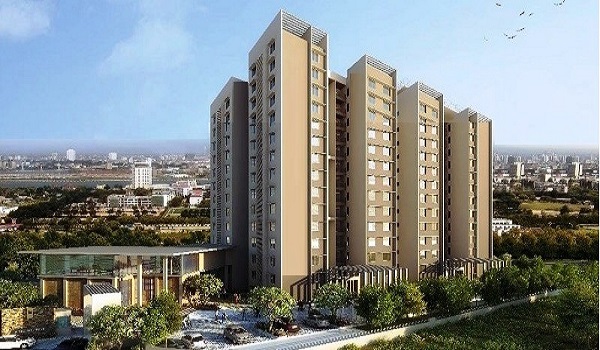
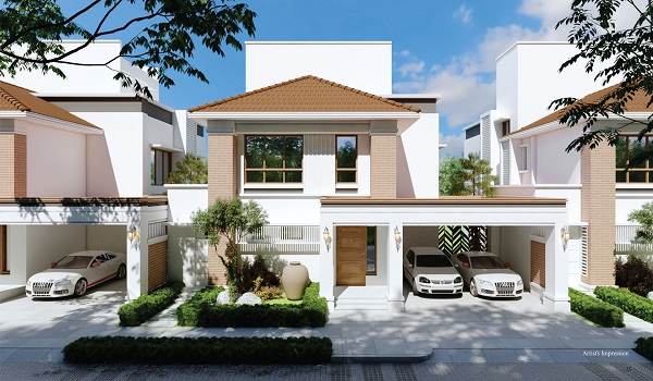
In communities like Birla Evara in Kodathi Village, you can see this in action. Each shade serves a purpose, whether it's calm in a bedroom, energy in a gym, or warmth in the lobby. In 2025, good design goes beyond what you see. It's about how it makes you feel.
Colors aren't just visual—they trigger real responses in the body and brain. Some raise your heart rate. Others slow it down. Here's what science tells us:
- Red can raise alertness and even blood pressure
- Blue tends to calm nerves and lower stress
- Green is tied to feelings of safety and balance
These effects come from nature and evolution. For example, red often signaled danger or excitement. Green meant fertile land and water—safe zones for early humans.
But there's also personal and cultural meaning. White may mean peace in one place and mourning in another. That's why diverse housing projects like those in Bangalore must consider residents' backgrounds.
Light matters too. The same color looks different in daylight vs. artificial light, or matte vs. glossy paint. Design teams in projects like Birla Evara use test patches to make sure colors match their intended feel throughout the day.
Warm Colors (Red, Orange, Yellow)
- Emotion: Energy, excitement, creativity, comfort
- Space: Makes rooms feel cozy or smaller
- Best For: Play areas, lounges, kitchens
- Use carefully—too much can feel chaotic
Cool Colors (Blue, Green, Lavender)
- Emotion: Calm, focus, peace, renewal
- Space: Opens up a room, adds airiness
- Best For: Bedrooms, home office, reading corners
- Add warm accents to avoid a cold feel
Neutral Colors (White, Grey, Beige, Greige)
- Emotion: Clean, stable, elegant, timeless
- Space: Reflects light, makes areas feel bigger
- Best For: Living rooms, lobbies, hallways
- Add textures or bolder accents for warmth
Black (Used in Small Doses)
- Emotion: Power, depth, drama
- Space: Shrinks space, adds richness
- Best For: Accent walls, decor, entry doors
Living Room
- Mood: Welcoming and social
- Try: Soft beige or taupe walls, with accents in emerald green, terracotta, or deep blue (a 2025 favorite)
- Tip: Use a darker feature wall to anchor the seating area
Bedroom
- Mood: Restful and soothing
- Try: Sage green, soft blue, pale lavender, or muted cream
- Avoid: Bright red or orange—they overstimulate and disturb sleep
Kitchen & Dining
- Mood: Energetic and inviting
- Try: Warm yellow or orange, mixed with white or grey cabinetry
- Bonus: Red and yellow may subtly boost appetite (yes, it's real)
- Vastu Suggestion: Use orange or red in moderation for positivity
Bathroom
- Mood: Fresh and clean
- Try: Aqua, seafoam green, or crisp white
- Bonus: Matte finish reduces glare, keeping the space soft
Home Office
- Mood: Focus and calm
- Try: Navy blue, olive green, or light gold
- Tip: Avoid flashy colors, too much yellow or red can be distracting
Kids' Room
- Mood: Playful, creative, safe
- Try: Light green, dusty pink, or pastel blue
- Balance fun walls with calm bedding to support restful sleep
Lobby/Entrance
- First impressions matter
- Try: Warm neutrals like beige or soft brown
- Add: A bold blue sofa or green plants to break monotony
Hallways
- Long and narrow? Use lighter shades to open it up
- Add: Art or murals for interest and direction
- Tip: Use different accent colors on different floors to help with wayfinding
Clubhouse/Lounge
- Goal: Cozy but active
- Try: Earthy tones like terracotta or deep reds, with cooler furniture to balance
- 2025 Trend: Mocha Mousse (Pantone 17-1230) for a grounded, calming tone
Gym/Yoga Room
- High-energy areas: Use reds or bold blues
- Yoga/meditation zones: Choose sage green or light grey
- Tip: Natural light boosts the color's impact—go for large windows
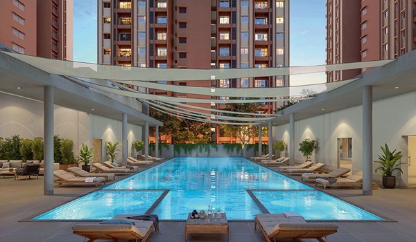
Swimming Pool Deck
- Mood: Refreshing
- Try: Mint, sea blue, or pale teal for walls and accents
- Make a room feel bigger: Use lighter, cooler tones
- Make a space feel cozier: Use darker, warmer colors
- Lower a ceiling: Paint it darker than the walls
- Add height: Keep ceilings light and walls deeper
- Highlight a wall: Choose a bold color for one wall and keep the rest neutral
Designers at Birla Evara use these tricks to make compact layouts feel more open and common areas feel more distinct—all through smart color choices.
- Earthy Greens & Nature Tones: Sage, olive, and forest green bring the outdoors in
- Greige & Soft Beiges: Replacing cold greys with warmer neutral blends
- Deep Blues & Moody Shades: Navy and indigo bring depth to bedrooms and study corners
- Muted Pastels: Lavender, dusty pink, and powder blue—grown-up and calming
- Textured Paints: Matte, lime wash, or sanded finishes for a lived-in, soft look
- Biophilic Colors: Inspired by nature—sand, wood, sky, and water tones
- Sample Before You Paint: Try colors in daylight and evening
- Use the 60-30-10 Rule: 60% dominant (walls), 30% secondary (furniture), 10% accent (art, cushions)
- Think of the Flow: Make sure colors work together from room to room
- Use Low-VOC Paints: Safer for your health and the planet
- Call a Pro for Big Spaces: Designers can help blend aesthetics with psychology
Color isn't just about design—it's about how a space makes you feel every single day. Whether it's a warm entrance, a calm bedroom, or a lively common lounge, color shapes your mood, your movement, and your memory.
At projects like Birla Evara, color is used with care—from the layout of shared zones to the comfort of private spaces. And that's the new standard in 2025. It's not about loud paint. It's about smart choices that make apartment living better for everyone.
