How Colors Affect Apartment Interiors & Shared Spaces: A Simple 2025 Design Guide
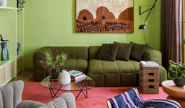
Color isn't just about how a home looks—it affects how people feel, behave, and even connect with others. From the walls in your bedroom to the shades in your apartment's clubhouse, color can shape your mood, boost focus, or bring comfort after a long day.
Since the pandemic, people have started paying more attention to how their homes and surroundings make them feel. In 2025, apartments are more than just places to live—they're where we work, rest, exercise, and gather with friends. And in well-designed communities like Birla Evara, every space is planned with this in mind.
This guide will help you understand how to use colors smartly inside your home and in common areas around your apartment building.
Color psychology is the idea that different colors can create different feelings. This happens because each color affects our brain in a unique way. For example, blue tends to make us feel calm, while red can bring energy. Designers and architects use this concept to build homes that don't just look good—but feel right too.
- Feeling it brings: Excitement, passion, urgency
- Good for: Dining rooms (encourages conversation), entryways (adds energy), or gyms (sparks movement)
- Avoid in: Bedrooms or small rooms—it can feel too strong
- Feeling it brings: Creativity, friendliness
- Good for: Kids' play areas, game rooms, kitchen walls, or creative co-working zones
- Feeling it brings: Happiness, energy
- Good for: Kitchens, breakfast corners, art rooms, and hallways that don't get much sunlight
- Use carefully: Too much yellow can feel harsh
- Feeling it brings: Peace, focus, trust
- Good for: Bedrooms (helps sleep), bathrooms (feels clean), work areas (improves focus)
- Common area tip: Blue walls in lounges or co-working corners help reduce stress
- Feeling it brings: Balance, freshness, nature
- Good for: Living rooms, bedrooms, and kitchens. In shared spaces, it works well in waiting areas or garden paths
- In homes like Birla Evara, greens often pair with indoor plants and open balconies for a calm feel
- Feeling it brings: Luxury, imagination, calm (especially lighter purples)
- Good for: Bedrooms, hobby rooms, or reading corners
- Tip: Use darker shades only in well-lit areas
- Feels clean and spacious. Works best in smaller homes to reflect light and create an airy look.
- Often used in kitchens, hallways, and ceilings.
- Feels modern and calm. Perfect for living rooms or corridors when mixed with colorful accents like green or navy.
- Feels warm and earthy. Great for common lounges, furniture, and walls in apartment lobbies.
- These are go-to colors in large residential projects like Birla Evara, where design needs to appeal to all age groups.
- Light changes color. Natural light makes shades look warmer or cooler depending on direction.
- Finish matters. A matte surface feels soft and quiet. A glossy finish feels bold and bright.
- Furniture and art matter too. A wall might look different depending on what's around it.
- Culture influences color choices. In some cultures, white means peace; in others, it means mourning. Designers often consider this in multi-family communities.
- Living Room
Use soft greens, warm greys, or calm blues. Add some bright cushions to bring in energy. - Bedroom
Choose light shades like blue, lavender, or beige. Avoid anything too bold or bright. - Kitchen
Whites, greys, or cheerful yellows work well. Add color through backsplashes or utensils. - Bathroom
Use blue or aqua tones for a spa-like feel. White tiles always keep it fresh. - Home Office
Navy or olive green walls can help focus. Add a warm-toned lamp or artwork to balance the cool colors. - Kids' Rooms
Use playful shades like orange, sky blue, or green. But make sure it's not too loud near sleeping areas.
- Lobby or Reception
First impressions matter. Neutrals like beige, brown, or soft grey keep things classy. Add a touch of green or blue to make it more welcoming. - Hallways
Use lighter shades to make the space look bigger. Accent walls or murals help avoid dullness. - Clubhouse or Lounge
Pick warm colors like cream or terracotta. Use cozy furniture to make it inviting. - Gym
Reds or bright blues create energy. For yoga zones, switch to pale green or light grey. - Swimming Pool Zone
Use cool tones like aqua, sea blue, or mint. These feel fresh and clean. - Outdoor Garden or Seating
Earthy tones like clay, sand, or leaf green blend beautifully with nature.
- Nature-Inspired Shades: Earthy greens, ocean blues, and clay browns help people feel grounded.
- Muted Tones: Soft, faded shades are replacing bold ones. Think dusty rose or faded teal.
- Greige and Warm Neutrals: A mix of grey and beige is perfect for both modern and cozy looks.
- Smart Lighting: Many communities now use lighting that changes through the day to match your mood.
- Eco-Friendly Paint: Look for low or zero-VOC paints. These are safer for your health and the environment. Developers like Birla Evara are already using them.
- Personal Touches: More homeowners are painting one wall in a bold color while keeping the rest neutral.
- Know the room's purpose. Is it for resting, working, or socializing?
- Try before you paint. Test colors on the wall and see them at different times of day.
- Use the 60-30-10 rule. 60% main color, 30% secondary, 10% for accents like cushions or art.
- Balance cool and warm. Too much of one can make a space feel flat.
- Think of flow. Make sure colors transition smoothly from one room to another.
- Ask a designer. Especially for common areas, a color expert can make a big difference.
Color is not just about trends—it's about feeling good in your space. Whether you're decorating a flat in Bangalore or building shared spaces in a township like Birla Evara, using color wisely can make every day feel better.
Good design starts with how it makes people feel. And color? That's where it begins.
